Sunday, 28 September 2014

30 Second Music Clip Task

In this task, I will be producing 2 different collages which revolve around the following music clip.


The collages will be on contrapuntal and parallel sounds based from this particular song.

Parallel Sound

The music would relate to these particular pictures as they rap about everything included in this collage.

Contrapuntal Sound

In this collage, I have picked out many scenes which usually this music would not accompany as a whole scene with music.


Development of Sound - 1920s

In this task I will be talking about the development of sound which occurred in the 1920s and how the first adapted to it.

The first sound-on-film was released in 1923. When it hit late 1920s, they started to try commercialise it. The films with synchronised sound were at the time called 'talkies' or 'talking pictures'.

The first feature film originally presented as a talkie was 1927's 'The Jazz Singer'. It was a successful film, which was made with Vitaphone, which was the leading sound-on-disc technology company.

By early 1930s, the talkies had become a global phenomenon, this helped Hollywood secure a position as one of the worlds most powerful in cultural/commercial systems. However, in Europe they had suspicion that dialogue would subvert the aesthetics of soundless cinema. In India, sound was the changing point for their very successful film industry and this caused them to expand rapidly. 

Friday, 26 September 2014

Media Consumption Worksheet

Newspapers

• Which daily newspapers (if any) do you read? None.

• What sections of newspapers do you turn to first, and why? Sports, because I like to keep up-to-date with the football news.

• What sections do you never read, and why? Financial section, adverts for homes and art reviews.

• What kinds of stories do you usually read and why? Big headlines because they intrigue me the most.

• Do you, or someone else, buy the newspaper you read? No. 

Magazines

• What magazines (if any) do you buy regularly? and why? I don't buy any magazines. 

• What sections of the magazines do you read and not read, and why? Sport, big headlines etc...

Television

• Approximately how many hours a week do you spend watching television? 5-6 hours a week

• What times of day do you usually watch television? Late nights (8-11pm)

• What programmes do you like best and why? CSI, because it has a lot of build up to a very tense ending.

• Do you watch alone or with others? Usually with others, but sometimes I may be alone.

• If you watch with others, who decides what you will watch? I do.

Radio

• What stations do you like best and why? Magic, Westside, anything which plays good music.

• Approximately how many hours a week do you spend listening to the radio? 1 hour a week.

• What times of the day do you usually listen to the radio? Whenever I am in my car.

• What stations do you dislike most and why? BBC Radio 2 and 3, very boring radio stations. 

• Do you listen alone or with others? With whoever is in the car.

• Where do you listen to the radio? In my car.

• What other activities (if any) do you do whilst listening to the radio? Drive around to places in my car.

Cinema

• What films, if any, have you seen in the cinema in the last month? None.

• What films have you seen in other places – for example, through rental, satellite film 

channels (free or otherwise) or through video-on-demand? We're the Millers.

• Who else watched the films with you? My brother.

• Who decided what films to watch? Me or my brother.

Internet

• How often do you access the internet? Extremely often. 

• Where do you access the internet? At home, at college or school, or at work? Mainly at home. 

• What are the main sites that you access? Youtube, Twitter, Instagram 

• What are the main reasons for accessing these sites – for example, for information, to make purchases, communicate with friends or for entertainment? I access these websites because they keep me entertained when I am bored, I go onto them and just browse videos and posts. 


• What other activities (if any) do you do whilst accessing the internet? I read football news on any websites which intrigue me. Such as persianleague.com which I keep up to date with football from my mother country. 

Monday, 22 September 2014

Mise-en-scene of film still image - Extension Task

Pursuit of Happyness (Drama + Biography, based on a true story)


To analyse this I will be using 'C.L.A.M.P.S' which stands for Clothing, Lighting, Audio (no sound), Make-up, Props and Setting. 

Clothing

The character is dressed in a full suit which could mean he had a successful life in the past. His son is also well dressed and by there clothing they do not show financial difficulty. 

Lighting

The lighting in the scene is provided through the lights in bathroom they are in.

Make-up

Their isn't enough facial detail for me to analyse any make-up used.


Props

In the bathroom, they have sat on tissue paper which is most probably to keep themselves clean of the floor. This shows a major sign of struggle as he has to reside in a bathroom. As well as all his luggage which is scattered across the floor. The effect of child bag which is next to the two characters makes the audience sympathise for them as the Dad is trying his best efforts for his son to be comforted.


Setting

The position that the Dad has held his son shows that he is distraught and lonely as his only company is his son, who which has to go through a struggle which he may not realise in the moment. The bathroom looks to be surrounded with valuables which may be extremely important to him, in order to gain financial stability. Under the brown bag is a scanner from quite a long time ago which most likely did contain some value, but now he has probably held onto it to try sell it.


Kassim the Dream (2008)


This film genre is a documentary, whereas the 'Pursuit of Happyness' is a hybrid of Drama and Biography (based on a true story). Similarly, both characters in the still images show a sign of struggle. In Kassim the Dream he shows a depressive state from his facial expression. The setting where the main character is situated shows punching bags which shows he may be determined to reach some sort of boxing goal, hence the punching bags. Also the lighting has been altered so that the punching bags stand out in the background. The effect of this that it makes it clear to the audience what goals the main character wants to reach. In 'Pursuit of Happyness', it isn't clear what goals he wants to reach but from the film title, he is desperate to find a route to happiness for him and his son. The main character of this film is showing a different sign of struggle then the struggle that the main character in the Pursuit of Happyness. In this film, he seems to want to pursue his boxing dream but something is stopping him from achieving that goal. In Pursuit of Happyness, he seems to have a financial struggle which is why they may be suffering from different circumstances. 


50 Cent Reebok Advert Analysis

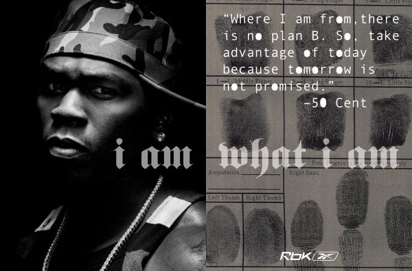
In this task, I will be analysing the following advert:


I think that this poster is aimed at a more younger audience within the age range of 15-25 years old. The people that will be more tempted by this sort of advert are the fans that idolise '50 Cent', This is the reason why Reebok have used him as he has a lot of people that follow his music. The advert is meant to motivate people, as there has been quote used (on the top right corner of the advert). The effect of including 50 Cent in the advert and him directly addressing the audience gives a better effect as they want to make it out that 50 Cent is trying to motivate the person that is reading the advert. 50 Cent is acting as a role model to other people, in reference to the quote 'i am what i am''. This motivates people so they can be themselves and not to act like someone that they aren't. The font of the 'i am what i am' is a Gothic font, which could mean that life is timeless. As they have included a quote from 50 Cent, this contributes to celebrity endorsement and his fans would want to see his face. This is why they have used a medium-close up shot of 50 Cent, this is to show the detail of his facial expression and pose. His pose is directly aimed at the audience as he is looking straight at the person reading it. The setting of the advert is not exactly clear, but as it is dark around him which suggests that it is not ideal to be in his position, but to just be yourself (50 Cent has a history of being involved in gun violence - he has been shot 9 times). The brand value is for people to have the freedom to be who they want to be and to value their identity. The logo was also imprinted on the bottom right corner as the audience would most likely remember it better. This is because humans read from right to left and the effect of having it as that will make them remember it better.  

Wednesday, 17 September 2014

Nike Poster Analysis - Cover Work


I think this poster/product is aimed at younger male audiences (11-16) which are striving to possibly become a top footballer. The advert is highly patriotic and it would not appeal to females. The background has a very unsaturated colour scheme which makes the colours of the person in the centre more vibrant and attractive. This makes it appeal more to younger audiences as they may aspire to become like the man in the poster. The man's position shows that he is performing a certain football skill which may be a motivational factor for some people as they may want to reach their objectives like this man is doing or seemingly looks to be doing. The environment which the man is situated at seems to present a very urban environment in a typical London-looking estate. The man is wearing a tracksuit and trainers which is what a lot of younger people wear around in recent times as the weather may contribute to this factor. The weather also looks quite cold as by the trees in the background, you can understand that it would be in the winter or autumn times. The man is not accompanied by anyone which shows his desire to be the best, as he is out playing in whatever weather conditions and under whatever circumstance. 

The copy of the advert is giving a direct address to the reader, which gives the person reading the advert a sense of dominance in reference to the question 'Who rules?'. The font of the 'Who rules?' is Gothic, they may have done this because the font is quite old fashion and was used during times England was ruled by a different monarchies. This refers back to the question 'Who rules?' as they want the audience to feel a sense of power and to make effort to become the top footballer. The 'Who rules?' is also done by graffiti which gives a more stronger sense of an urban environment as graffiti is common around areas which the man is playing at (estate).  

Tuesday, 16 September 2014

8 Film Poster Analysis

In this task I will be analysing 8 different film posters and I will be answering the 3 questions listed below:

1. What do you think the film is about and what might the storyline be?
2. What genre(s) do you think the film belongs to?
3. Who do you think is the target audience? 

Blade Runner (1982)

1. I think this film is about an individual who may be from space or sent from space to go to Earth and complete certain tasks which he has been allocated. The name 'Blade Runner' suggests that a 'Blade' may be his weapon of choice. 
2. I think this film majors in Science-Fiction but may be a hybrid of Action and Science-Fiction as he has a gun in his hand next to his face which presents a sort of aggression. 
3. I think Blade Runner is a film which was aimed towards possibly 13-18 year old at the time the film came out because Science-Fiction films were different to usual films which came out in the time of the release of the film. In this generation, it may be aimed at older people because the film was released over 30 years ago. This style of film may not intrigue younger audiences in our current time.  


Scary Movie 2 (2001)

1. I think Scary Movie 2 is film about a few teens which go through an unforgettable experience, but which has a mix amount of parodies within the film. I found this out because they portray the black person as the most vulnerable which is basically stereotyping how black people will always die first in a horror film, they have done this for the humour of it obviously, which is why he is placed in the middle and in the centre of the whole poster. 
2. Scary Movie 2 looks mainly aimed at Comedy and Horror. The presentation of horror is shown through the the movie title quite obviously 'Scary Movie', but ironically they have done this for the humour of it as a film which is Horror based would usually not call the film itself a 'Scary Movie'. 
3. I think the target audience for this film would be aimed at a more younger audience, aged around 16-25 years old as the humour is mainly targeted towards younger people and some people in the older generation may not understand certain jokes which are used in the film. 

Uzak (2002) 


1. I think that this film may be about a man which has been left by someone because he is completely alone and isolated in the film poster. The smoke in the picture may connote that a pain will come into his life as smoke is a negative connotation and the poster is covered with the majority of smoke. This could also mean that something will take over his life and it isn't good because the smoke is extremely dense and dark which would mean that it will not be the most cheerful film. The colour scheme is not too broad and only consists of dark brown/khaki colours which don't promote happiness.   
2. I think this film will come under either a Drama or Thriller as the film does not show any sign of action and is quite a subtle looking poster. If there was a sign of destruction it would likely tell a different story. 
3. I think the target audience for this film is mainly people aged from 30-50 year old because in the poster it looks like he is suffering and people usually aged 30-50 may be able to relate with the film as they might be in a state similar like him.

 I'm Not Scared (2003)
                                           
    
1. I think 'I'm Not Scared' is based on a boy which discovers something out of the ordinary. By his facial expression he shows anger and determined, which this links back to the title 'I'm Not Scared' suggesting that he will do whatever he can and that he isn't afraid of the consequences despite them possibly being bad.
2. I think this film is based on the genre of Crime and Drama because usually if there's a bad consequence then it usually is against the law which means that is Crime. Also it could be very dramatic as he is determined to do whatever it takes and for it being someone as young as him will make it more dramatic for the audience.


Bride & Prejudice (2004)
1. I think that Bride & Prejudice is about a couple which may want to start a life together, but because of the prejudice which exists between their cultures, they frown upon it. The couple are presented as happy together. 2. I think that this film is based on Drama and Comedy because the film is presented in a happy way through the multiple colours which exist on the poster. I think that it is also based on Drama due to the movie title. The word 'Prejudice' is a very controversial word, which is likely to cause Drama.
3. I think the target audience would be couples either married or non-married.
Million Dollar Baby (2004)

1. I think Million Dollar Baby is about a female who looks like she is wanting to pursue a goal. The other men look like people which may help her because they seem to be behind her in an act of defence. The colour scheme of the poster is just black and white which brings tension onto the poster as there is no colour - colour usually having many presentations. 
2. I think this film may belong to the Drama category as she from what I have analysed so far, she seems to have goals which may have certain struggles in order to get to her goals. 
3. I think the target audience for this film may be people aged from 18-27 years old because from the colour scheme it would not attract a younger audience as they are more intrigued by films and film posters which have a range of colours. 


Pirates of the Caribbean: Dead Man's Chest (2006) PosterPirates of the Caribbean (2006)

1. I think this film is about Pirates which exist in the Caribbean, referring from the title. It might have to do with a chest which contains very rare treasures and which has been hidden away for a long time.
2. I think this film belongs into the 'Adventure' or 'Action' as usually Pirates condone violence which is why I have included Action. I have said Adventure as well because Pirates usually voyage on ships for most of their lives in search for treasure which is why I think they will go on an adventure in search for this treasure. 
3. I think this is aimed at a younger audience from 12-18, because Pirates are fictional and younger audiences usually enjoy more fictional stuff. 


Sunday, 7 September 2014

Introduction to A Level Media

So as I said 2 years ago....

I chose Media at A Level as I wish to pursue a career relating a position in media industry, more eagerly to become a journalist in a big news corporation. I also picked Media at A Level because as you can tell by my old blog, I enjoyed it highly and I think it's safe to say that others enjoyed it as much as me, so it's a real privilege to actually be on the course.

I think Media is a subject which is essential to be taught in my opinion, as our lives revolve around it and it effects people in their day to day lives. If the Media never existed then their would be high lackage of information and people would be very narrow minded towards things. 

This is why I have chosen Media.